
WAY app previews
CLIENT
WAY
EXPERTISE
Branding
Visual Design
Creative Direction
Content Marketing
The Challenge
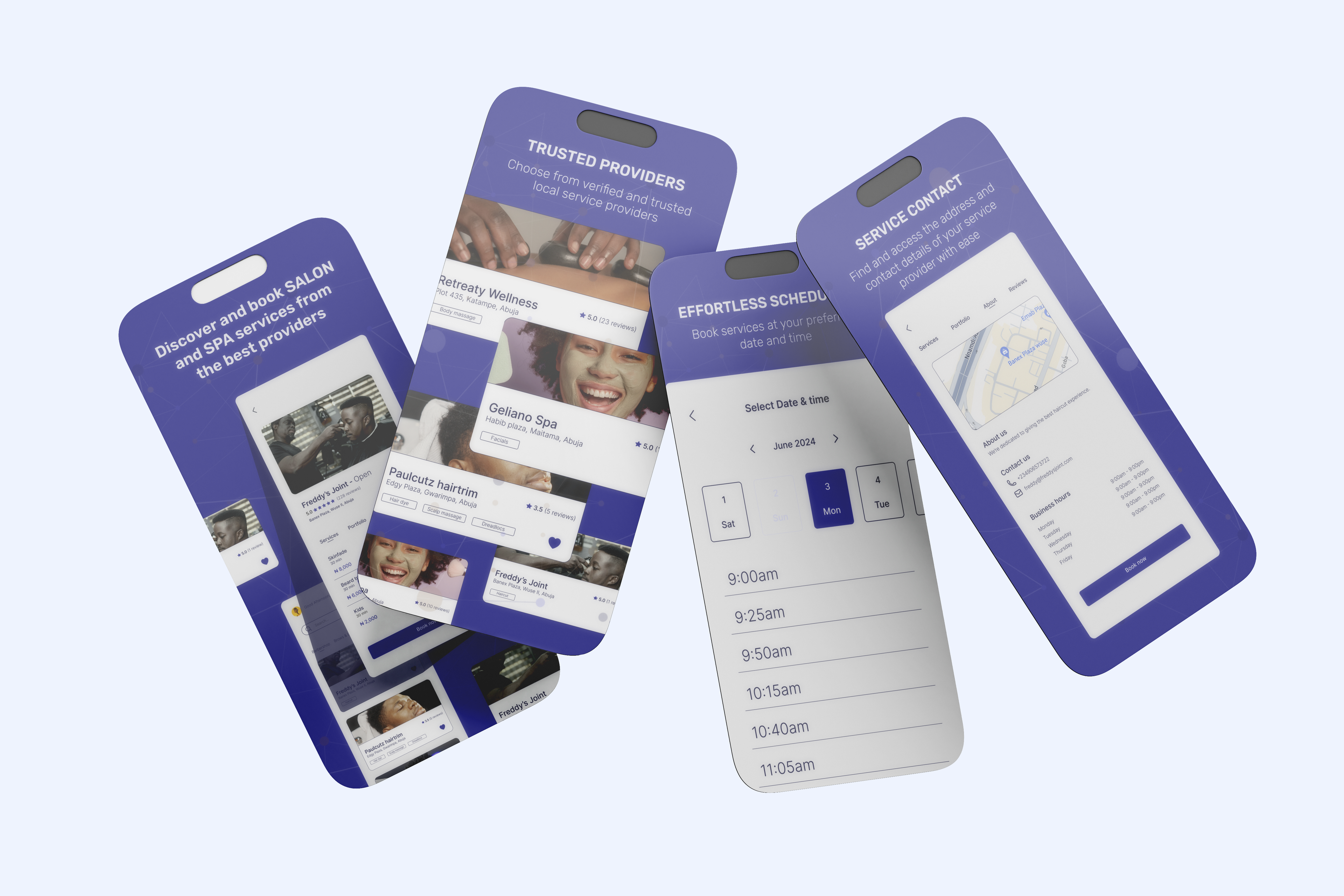
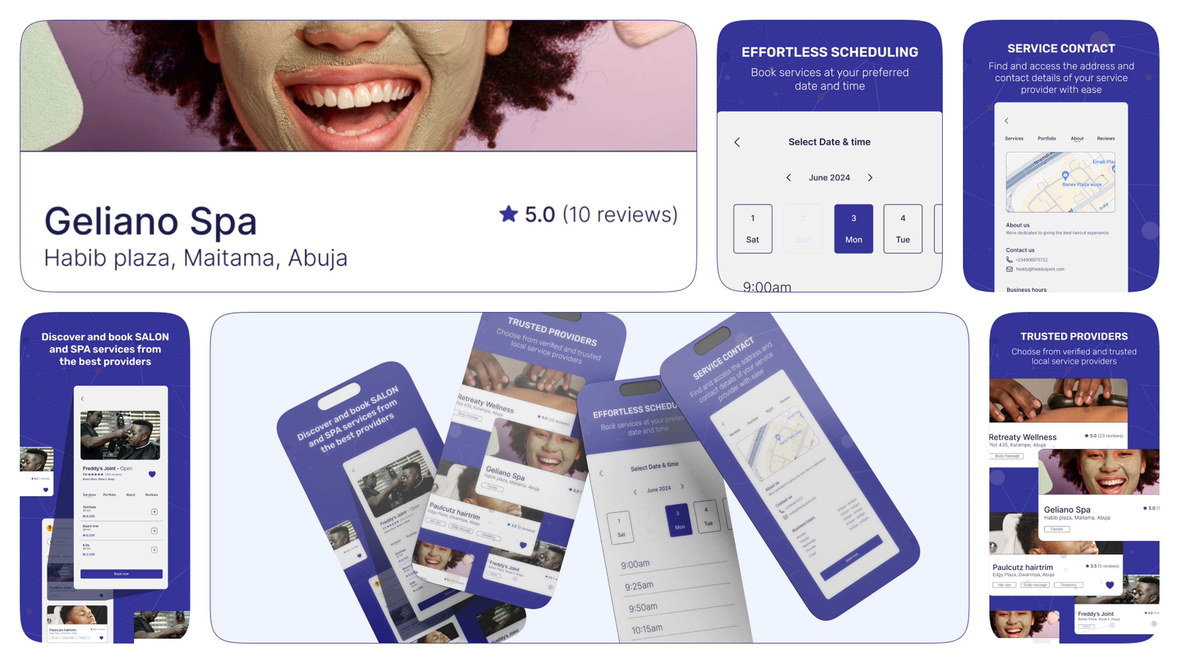
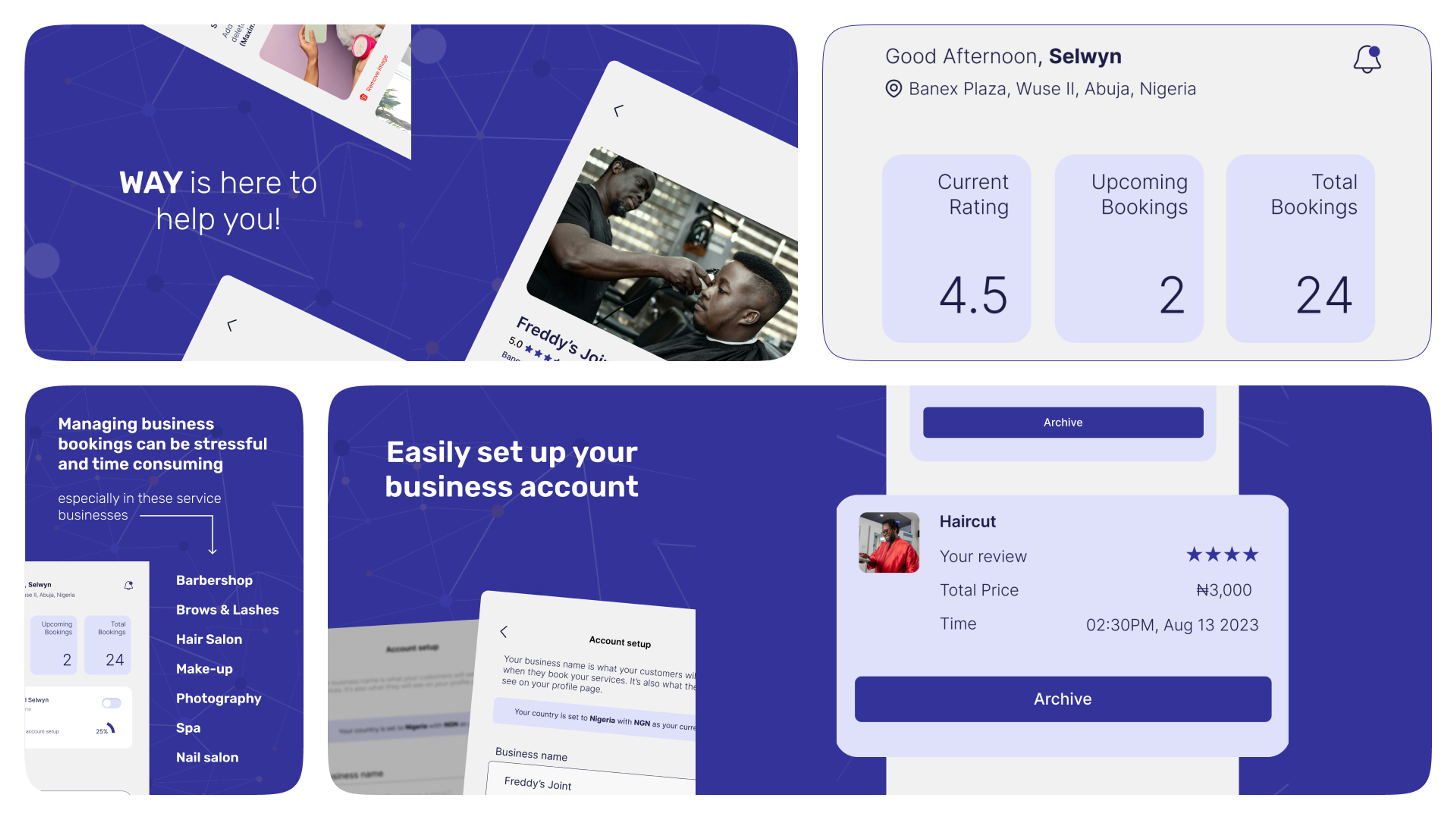
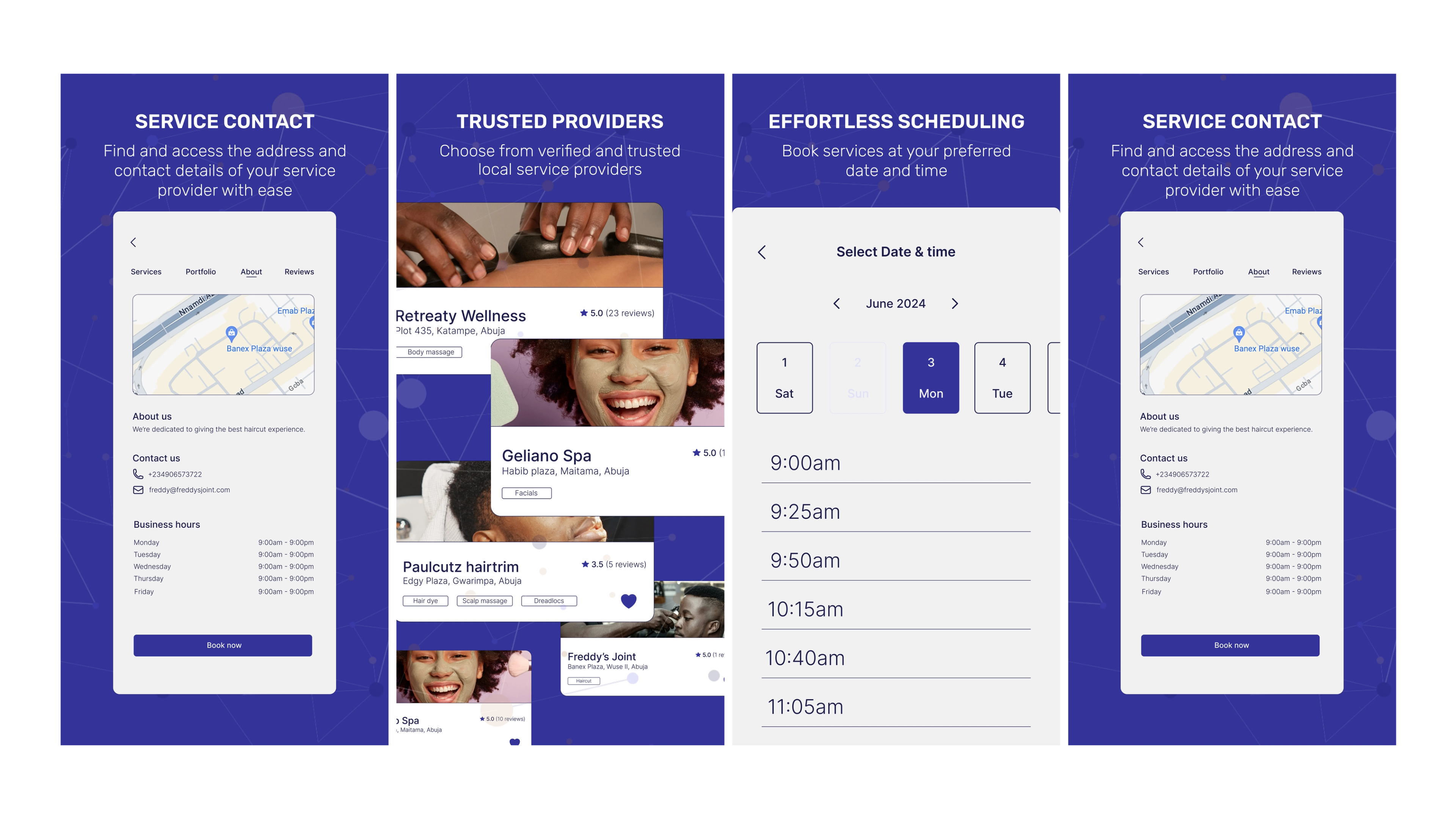
WAY needed to grab attention and build trust at the very first point of contact: the App Store and Google Play. Their old app previews were generic, inconsistent with their brand, and didn’t do justice to what the app could offer new users.
Our Approach
We set out to design compelling, polished app preview screens that would instantly tell new users: this is a modern, trustworthy, and engaging brand.
To make sure every screen looked and felt unmistakably “WAY,” we first laid down solid brand guidelines — defining their colors, typography, and overall style. With that foundation, we designed the app store visuals to highlight key features, keep the messaging clear, and create a smooth visual flow from screen to screen.


The Result
Stronger first impressions, more visual appeal, and a consistent story from the app store to the app itself. WAY now greets potential users with previews that sell the experience before they even hit “Install.”
"WAY needed to grab attention and build trust at the very first point of contact: the App Store and Google Play. Their old app previews were generic, inconsistent with their brand, and didn’t do justice to what the app could offer new users."

Shuaib
WAY

Reach out!
Let's maximize your brand’s potential